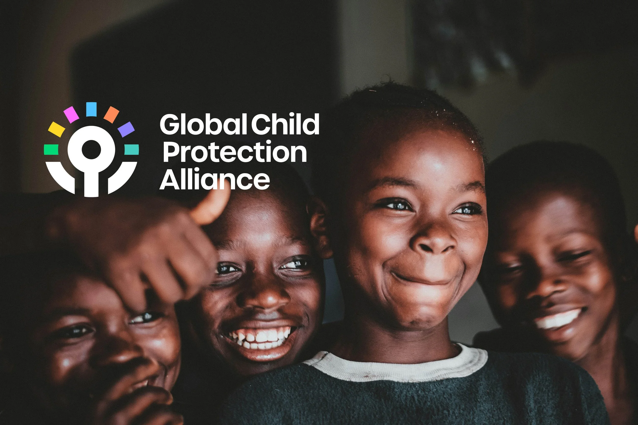
The Global Child Protection Alliance a new identity for a global collective of charities supporting children worldwide.
The challenge
How do you create a unifying visual identity for a newly formed global alliance of diverse child-focused organisations, while reflecting their deep theological foundation and mission to empower the church worldwide?
The Global Child Protection Alliance is formed of a collaborative of organisations seeking to work more effectively together to protect children. The Alliance approached Strategicreative to develop a visual identity that would unite their community, representing organisations including Compassion UK, Global Children's Forum, World Vision International, Scripture Union International, Global Connections, Global Voices, Mãos Dadas Network, AsiaCMS, Thirtyone:eight, CSPN, OneHope, and Viva Network, spanning continents from the UK to Brazil and across Asia.
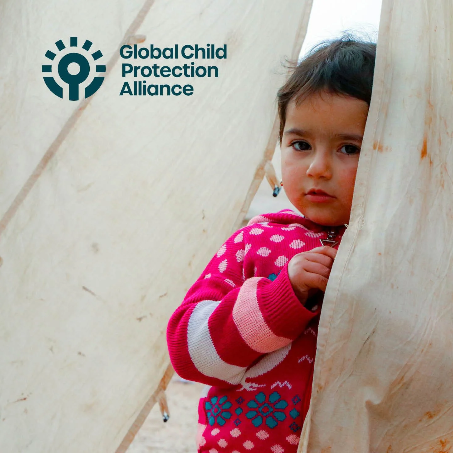
The challenge was creating a unifying identity that clearly communicates their mission: empowering the global church to ensure every child is safe, supported, and free to grow into all they were created to be. As a global Alliance, the identity needed to work seamlessly across multiple languages, cultures, and continents.
The process
Getting under the skin
Working closely with the Alliance's Steering Group, representing the founding organisations across multiple continents, I explored their theological foundations, collaborative structure, and vision for global impact. Understanding their biblical mandate for child protection was essential. This wasn't just about creating a logo; it was establishing a visual foundation rooted in strategic clarity about who they are and what they stand for.
Uncovering the magic
Through strategic discovery work, core themes emerged that would inform the visual identity. Looking at other global organisations, it became clear the Alliance needed a powerful symbol that could work hard alongside the name to clearly communicate their reason for being.
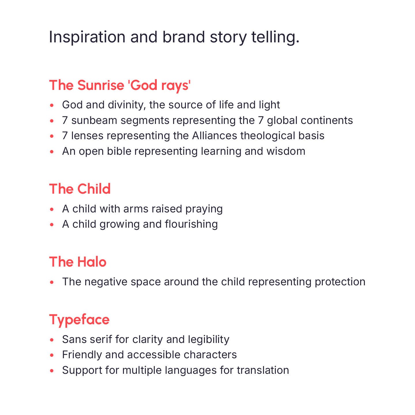
The number seven revealed itself as symbolically significant: seven continents, seven theological foundations. This provided both meaningful structure and a visual foundation for the brand.
Getting right to the heart
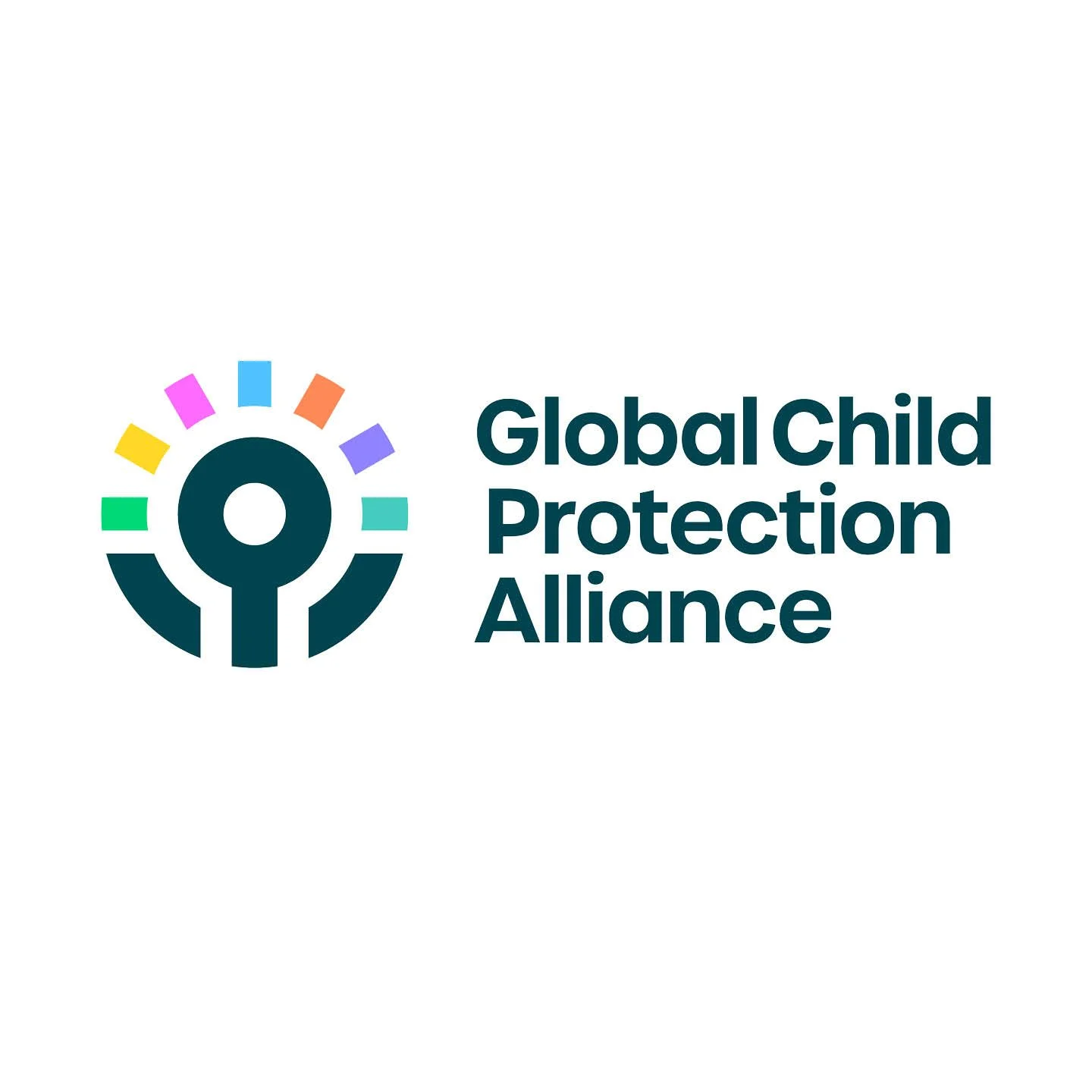
The visual concept draws from biblical imagery central to the Alliance's mission. The sunrise 'God rays' represent divinity as the source of all life and light. Seven sunbeam segments radiate outward, each representing both a global continent and one of the Alliance's theological foundations. An open bible forms the base, representing learning and wisdom.
At the centre, a child with arms raised embodies dual meaning: hands lifted in prayer and a young person growing, flourishing, reaching toward their full potential. The negative space surrounding the child creates a protective halo, a visual representation of the safety and value every child deserves.
The typography works across multiple languages, with friendly letterforms that avoid a corporate feell.
Consistency delivered
The logo has been delivered and launched, providing the foundation for the Alliance's global visual presence. Strategic messaging work continues alongside development of a comprehensive brand system.
This is very much a work in progress, with much more to come as the Alliance expands its global network.
The results so far
The new logo launched in early 2026, providing the Alliance with a recognisable symbol that communicates hope, faith, and protection across diverse cultural contexts.
Services
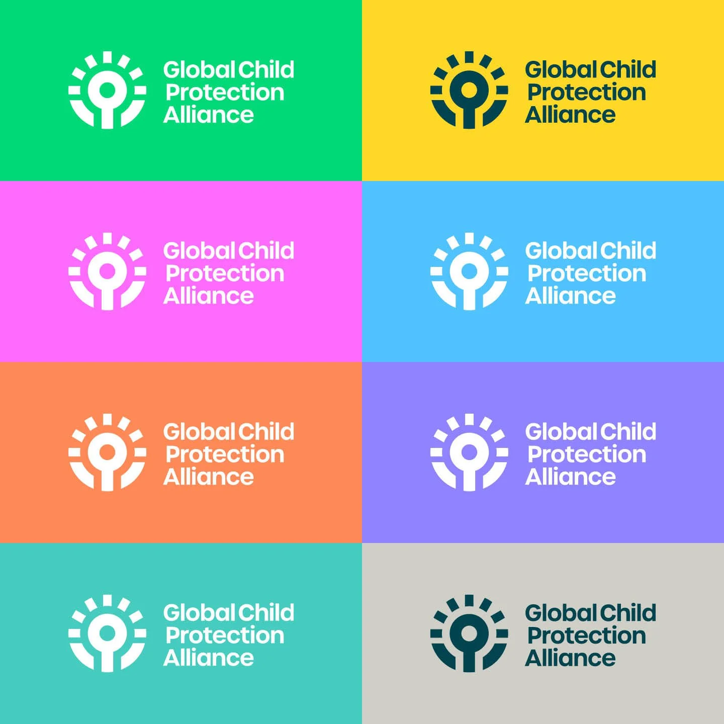
Brand identity + Strategic positioning (in development) + Colour palette + Typography system + Wider brand (in development)
“It has been amazing to work with you again. You have nailed it and translated our DNA into this fantastic piece of brand work."
Justin Humphries – Founding Member Global Child Protection Alliance
Some of the work so far
-
![]()
Brand symbol
-
![]()
Brand logo
-
![]()
Brand colours
-
![]()
Brand imagery
-
![]()
Brand logo
-
![]()
Brand story & inspiration