Thirtyone:eightcomplete strategic rebrand and naming for a safeguarding charity serving faith-based organisations.

The challenge
When a safeguarding charity's name and brand no longer reflect their comprehensive service offering, how do you create a new identity that captures their unique position in the sector? CCPAS needed a complete transformation, from name to visual identity, that would better communicate their full range of safeguarding services to churches and faith-based organisations while differentiating them in a crowded marketplace.
The process
Getting under the skin
Deep dive into the safeguarding sector revealed that 80% of competitors used acronyms with no emotional connection, each offered fragmented services rather than comprehensive solutions, and none clearly communicated their scope of protecting both children and adults.
Uncovering the magic
The organisation was truly unique in the sector: "We're the only organisation that does everything. There's nobody else like us." They combined expertise, on-the-ground experience, Christian values, and thought leadership in ways competitors couldn't match.
Getting right to the heart
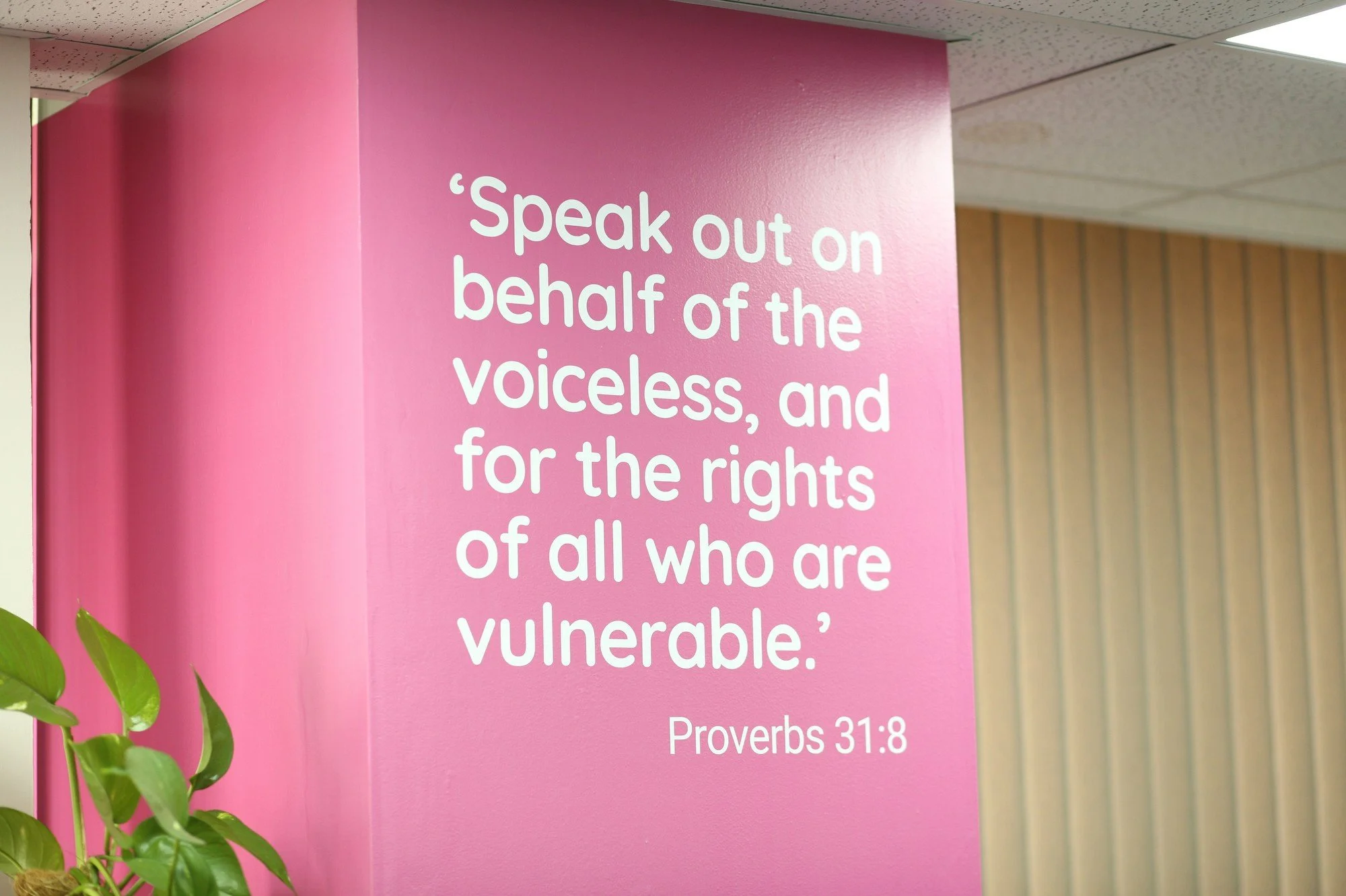
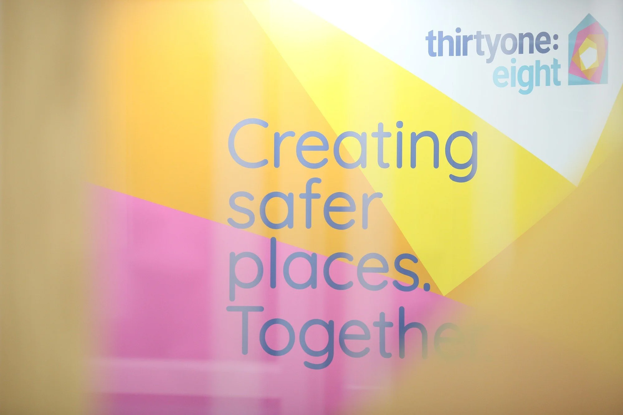
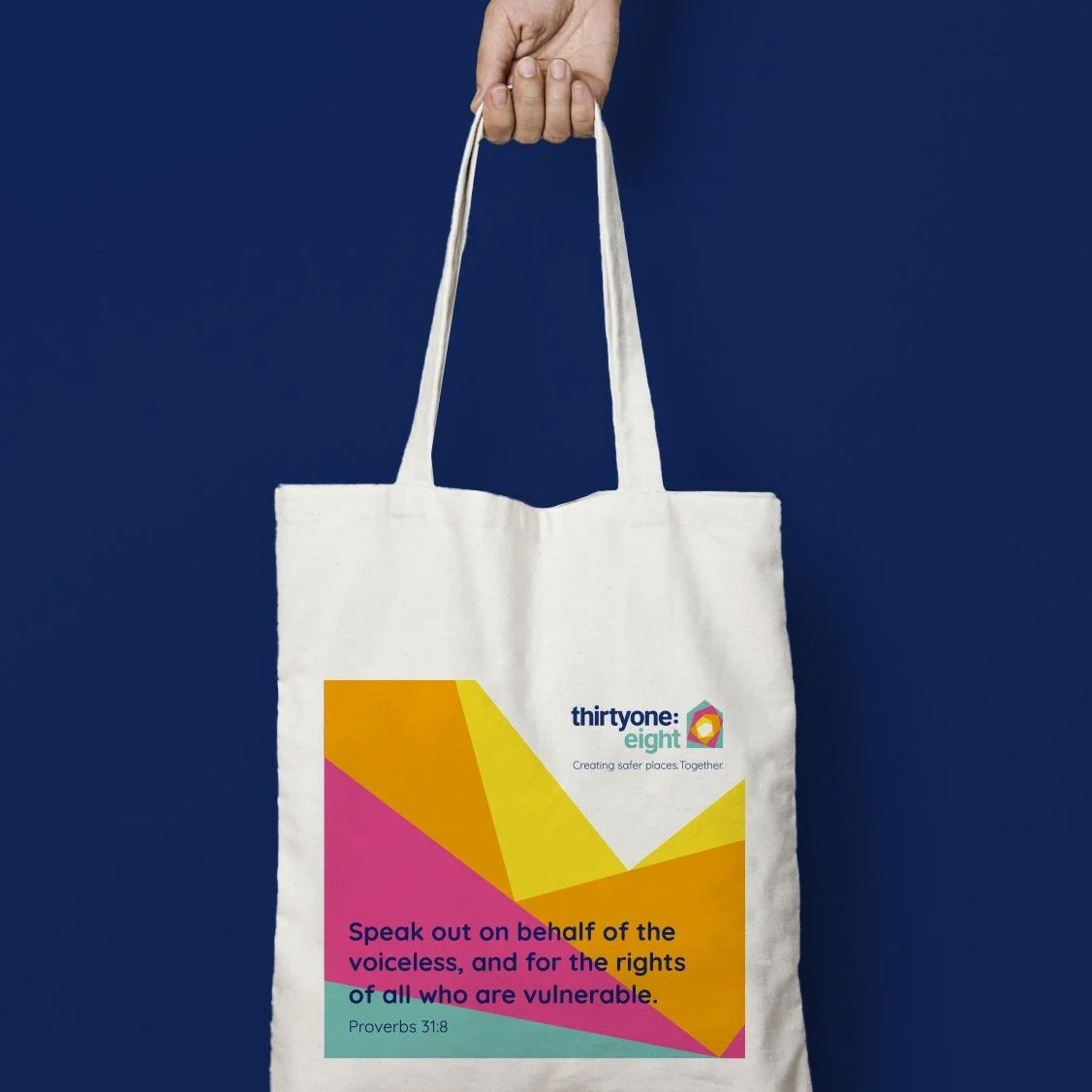
The core proposition "To protect vulnerable people" through empowerment, advice, support and thought leadership. This led to "Creating safer places. Together." and the new name "Thirtyone:eight" – a biblical reference to Proverbs 31:8: "Speak out on behalf of the voiceless, and for the rights of all who are vulnerable."
Consistency delivered
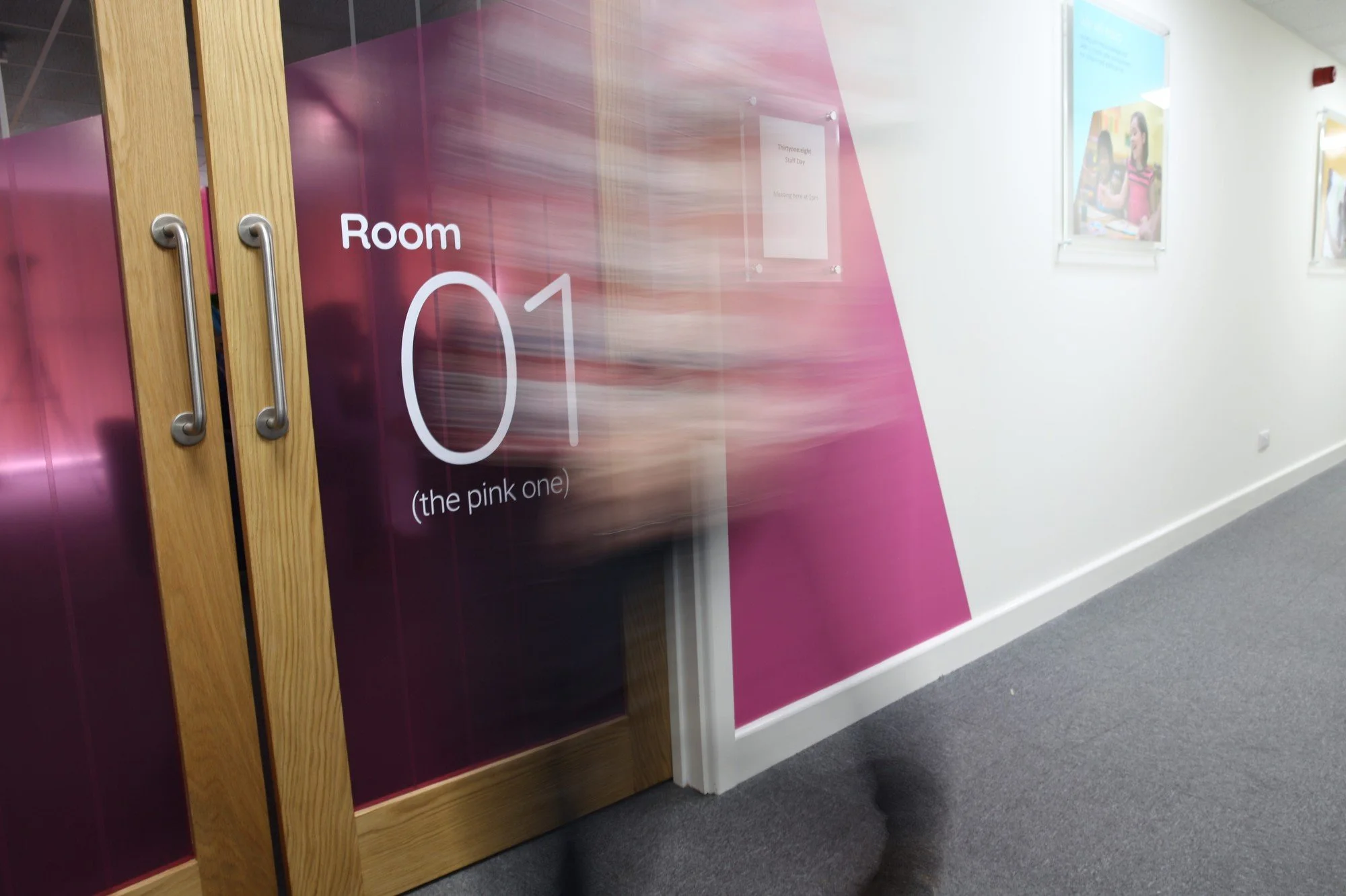
A distinctive "safe place" symbol representing an individual surrounded by layers of protection, directly reflecting the comprehensive layers of services provided. The visual system extended from this central device, supported by the foundational scripture reference.
The results
The rebrand achieved award-winning recognition and transformed how stakeholders understood the organisation's comprehensive offering. The biblical name created immediate emotional connection with their faith-based audience while the layered protection symbol clearly communicated their unique approach to safeguarding services.
Services
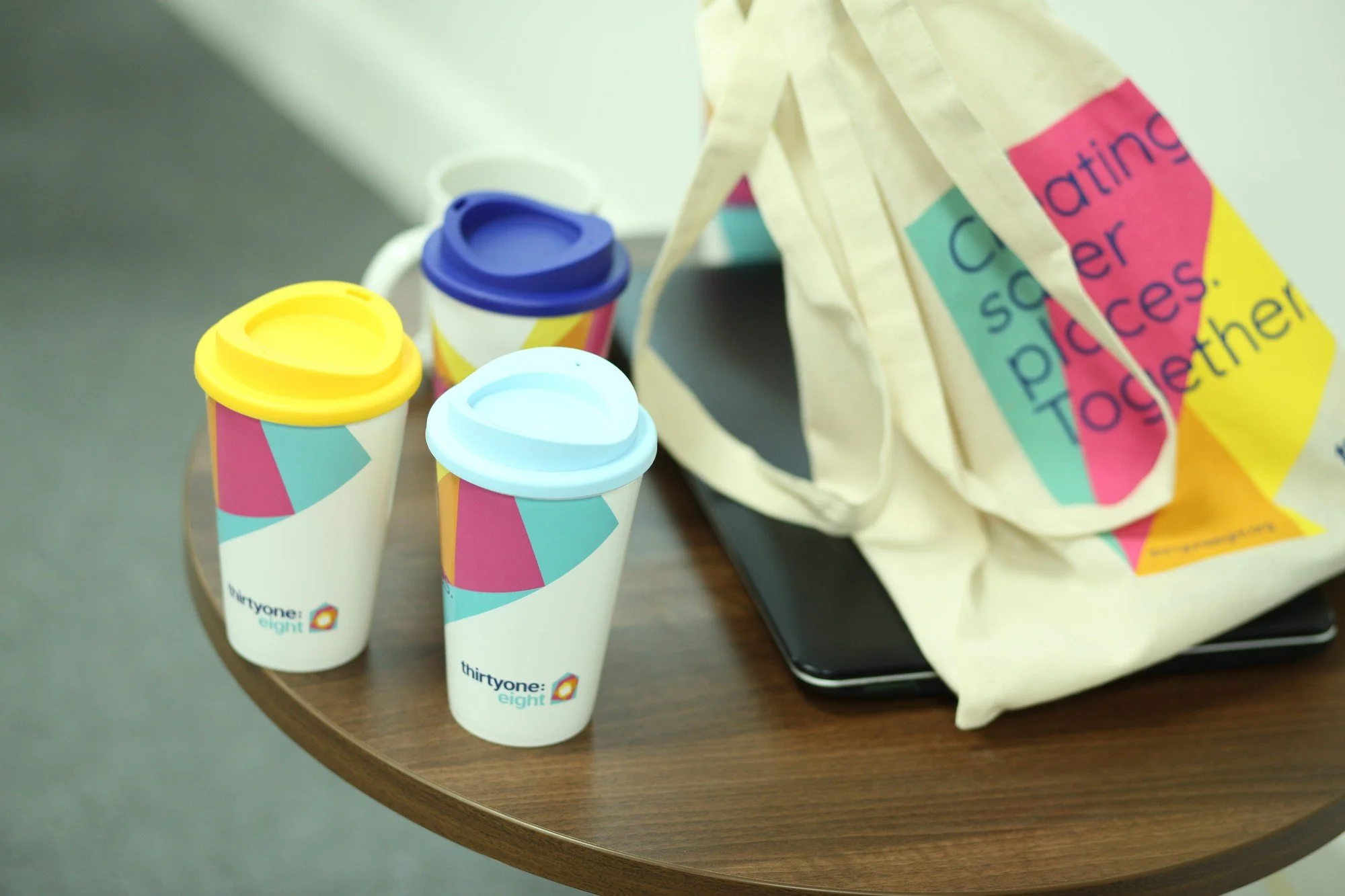
Naming + Brand audit + Marketing audit + Sector audit + Brand positioning + Creative platform + Guidelines + Printed collateral + Event materials + Photographic art direction + Event materials + Merchandise + Environmental branding + Sub branding + Campaigns
Work completed whilst at EPLS Design“Thanks so much for your work with us over the last few years. From the rename and rebrand to all of the other smaller projects and all of the brainstorming sessions - all have been enjoyable, productive and actually fun. I shall miss your humour and ability to ask the 'grounding' and insightful questions."
Steve Ball, CEO (Operations) - Thirtyone:eightSome examples of the work
-
![]()
Naming inspiration
-
![]()
Printed publications
-
![]()
Branded interiors
-
![]()
Exhibitions
-
![]()
Environmental branding
-
![]()
Brand positioning
-
![]()
Merchandise
-
![]()
Stationery
-
![]()
Tote bags


“When it comes to branding and design, Chris absolutely knows his stuff. Working with him on our award-winning charity rebrand was one of the best projects I've worked on, and Chris was a massive part of that. He helped us to really get under the skin of our organisation, taking time to get to know us and using his creative talents to breathe life into our new brand enabling us to achieve our objectives and goals.”
Peter Wright, Head of Marketing & Communications - Thirtyone:eight